

Capjoy Photography
Kellyn has long been one of my favorite local photographers, thanks to her lively and friendly approach and her colorful style. Per her business name, she captures joyful memories through the power of photography, and isn’t afraid to play with light, color, and texture!


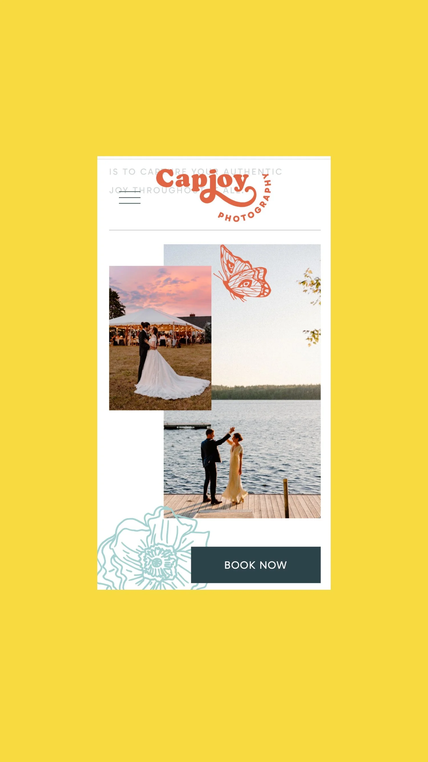
Here’s how Kellyn effectively incorporated her branding into her website:
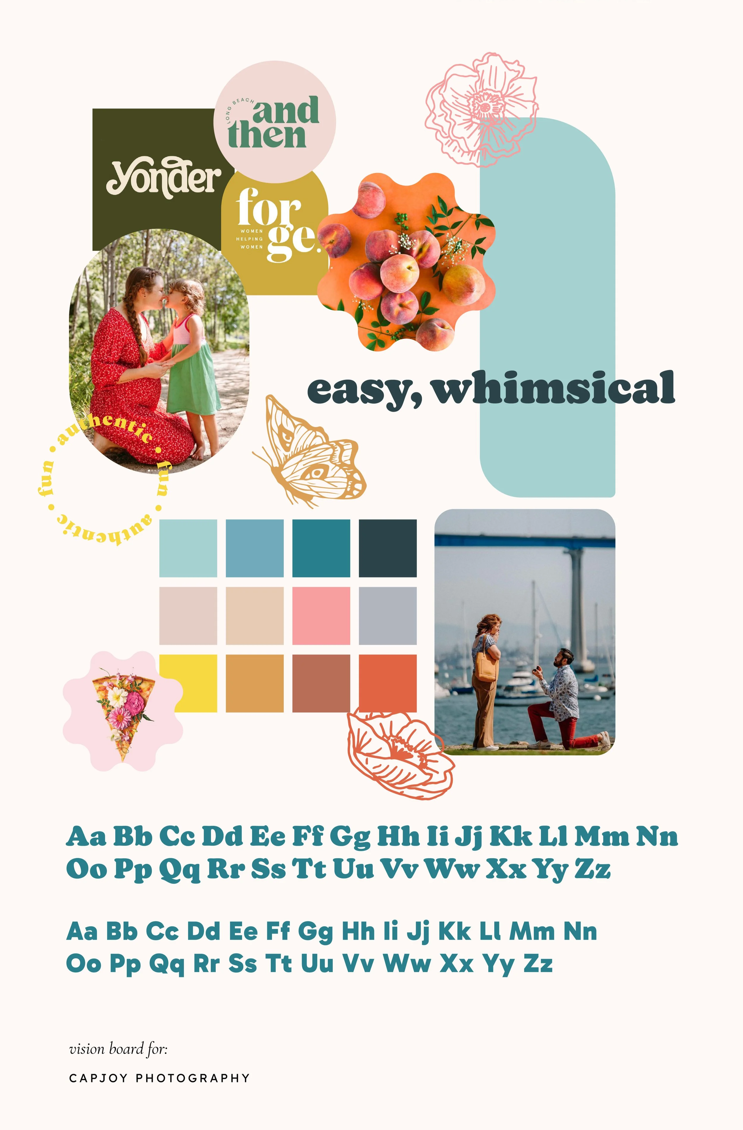
She added in all of her brand colors. I include hex codes (they look like this: #fffff) in all of my brand palettes so my clients can easily use their specific colors across all marketing materials and content.
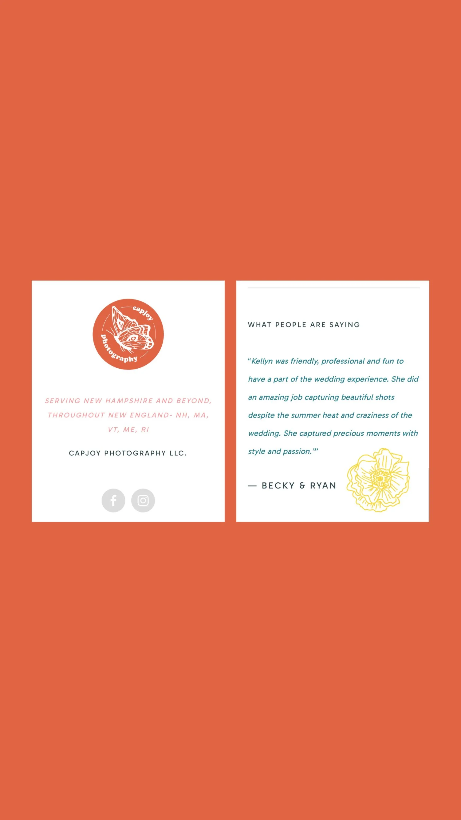
She made absolutely gorgeous use of her brand illustrations! I drew little flower and butterfly elements for her, and included them in her brand kit in all of her brand colors. They all have transparent backgrounds so that she could overlay them throughout her website and graphics. These bring such uniqueness and personality to her brand.
She used all of her brand fonts throughout her website to make sure everything feels cohesive and consistent (very important for brand recognizability).
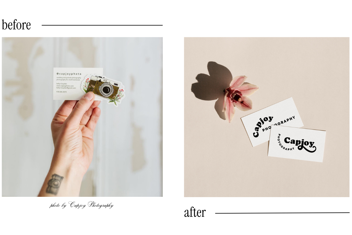
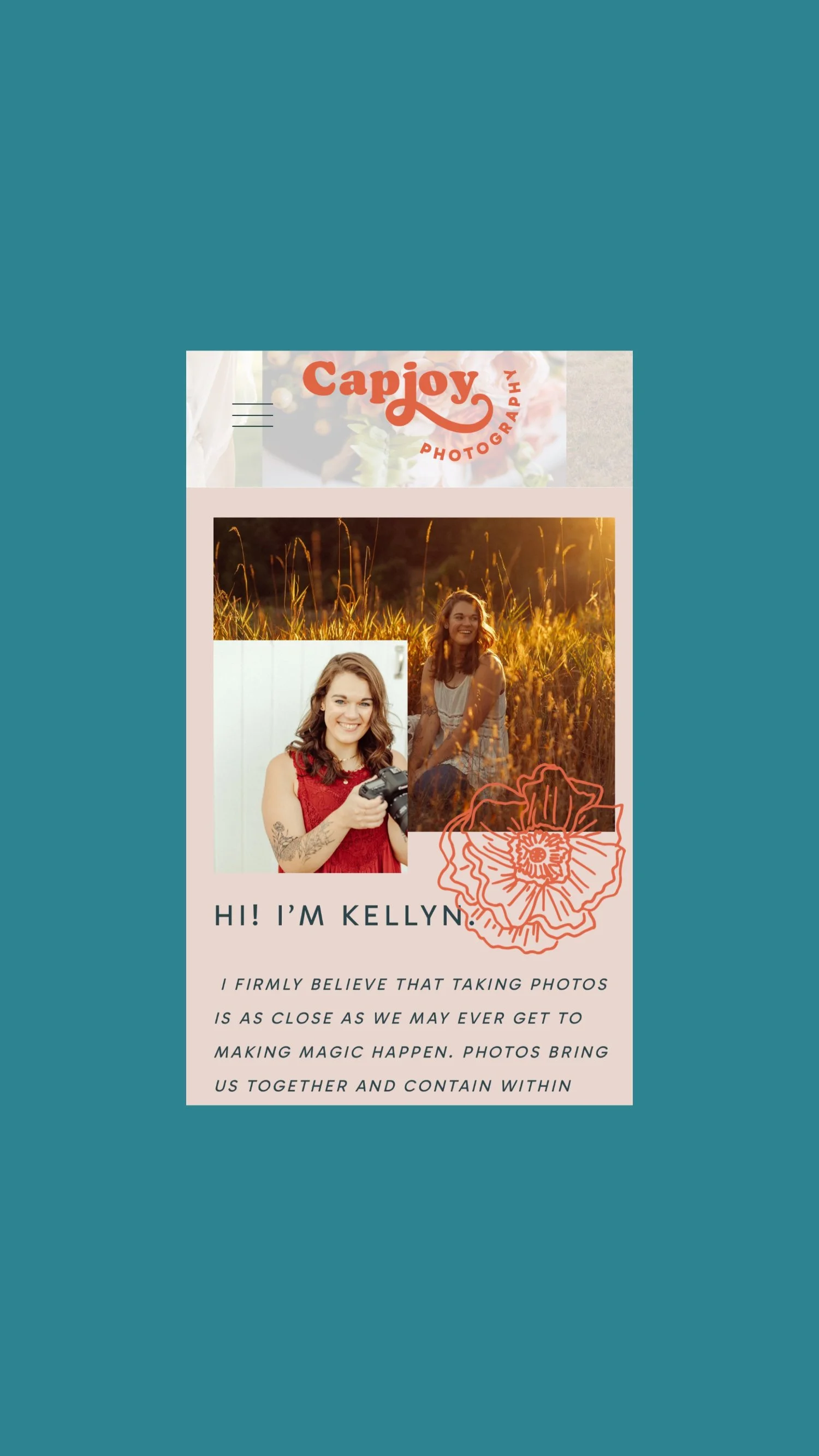
Last but not least, she made sure her logo variations are clearly visible throughout her website. Her main logo is at the top of each page, while her monogram with the butterfly completes her website footer. Both are recognizable as Capjoy Photography!